In the spirit of college basektball's "March Madness," the weekly poll for this month will be replaced by a tournament pitting famous studio logos against one another. For each matchup, the winner will be determined by the studio logo that receives the most votes. The winners "play" each other the next week until, by the end of March, we have a tournament champion. The brackets are shown below (click the graphic to enlarge):
There's always controversy on "Selection Sunday," so feel free to disagree with the logos picked for the tournament. The committee (OK, it was just me) tried to pick a diverse group of well-known favorites, plus a couple of underdogs like The Archers logo.
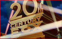
The two matchups for this week pit Universal against Warner Bros. and 20th Century-Fox against The Archers.
Universal's logo has changed as many as nine times over the years, from an airplane circling the Earth ("It's a Universal Picture!") to the "Art Deco Globe" (shown on the right) to variations of its current color logo.
The Warner Bros. shield may have originated as early as the late 1920s. Although it uas undergone minor tweaks over the years, the "WB" letters within the shield have been there since the early 1930s. The logo pictured here was designed especially for 1938's The Adventures of Robin Hood.
The heavy favorite in this week's second matchup is 20th Century-Fox searchlight logo. It was designed in 1933 by artist Emil Kosa, Jr. for 20th Century Pictures. When 20th Century merged with the Fox Film Corporation in 1935, Kosa redesigned the logo for the new company name.
The Archers logo was born when filmmakers Michael Powell and Emeric Pressberger formed their own production company in 1942 called...The Archers. The partnership ended amicably in 1957, though Powell continued to use a variation of the archery shield logo for some of his films.
Those are the matchups for this week. Please cast your votes in the green sidebar on the right. Next week, MGM takes on Republic and Columbia plays Paramount!


Very interesting idea for a poll, Rick.
ReplyDeleteWow, This is really Film Madness, talk about Brackets.
ReplyDeleteRick, Very interesting!
ReplyDeleteMy favorite logo is the old Universal logo with the airplane flying around the globe - Delightful! Second favorite is the Universal logo pictured above. This is not related to what they produced, just the logo itself. But - NO RKO?!?!
ReplyDeleteRKO got bumped so we can include some "Cinderellas" like The Archers and Republic. So yes, RKO got rooked!
ReplyDeleteThis is March madness at its best! I love the Universal logo despite having a special fondness for the WB logo Rick has posted for "The Adventures of Robin Hood". I wondered if, when the millennium changed, 20th Century Fox would change, too. Yet it remained the same, which was nice to see. However, since the Archers seems like a dark horse I think I will champion it as well.
ReplyDeleteBy the way, I think this is a grand idea for a poll, Rick! And I loved Paul's comment about Film Madness.
ReplyDelete